
EXEED / UAE / BRAND IDENTITY / 2019
Industrial strength
A human expression
One group, many businesses, and a new place in people’s homes. An identity designed to bring them together.
THE BUSINESS & THE BRIEF
A bigger world for Exeed
Exeed Industries is the industrial arm of National Holding, with operations across the UAE, Jordan and the wider MENA region. Building materials, manufacturing and home appliances put the group in front of very different audiences. A construction customer and someone choosing a refrigerator might meet the same name with quite different expectations.
Our 2019 brief brought that challenge into focus. Following a period of growth, Exeed wanted to expand its local and export presence. Home appliances were an immediate priority: the identity needed to work on products approaching shipment. But the decision could not be made for that division alone. The same mark would represent the wider group, carrying industrial confidence into a more personal, consumer-facing setting.
THE DESIGN RATIONALE
Movement with a purpose
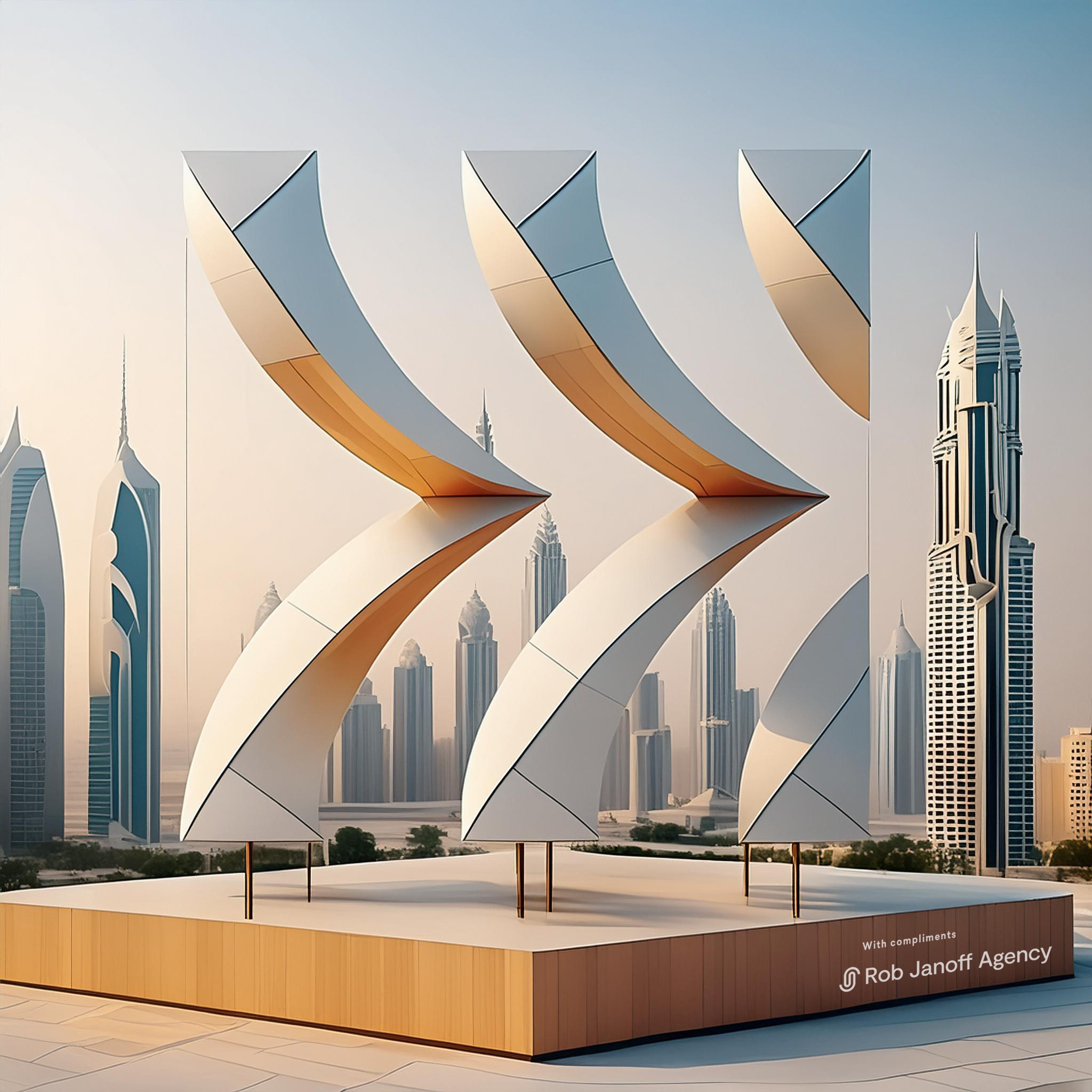
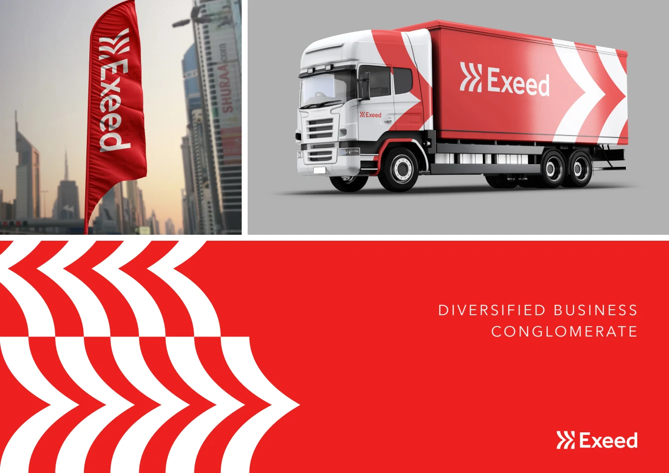
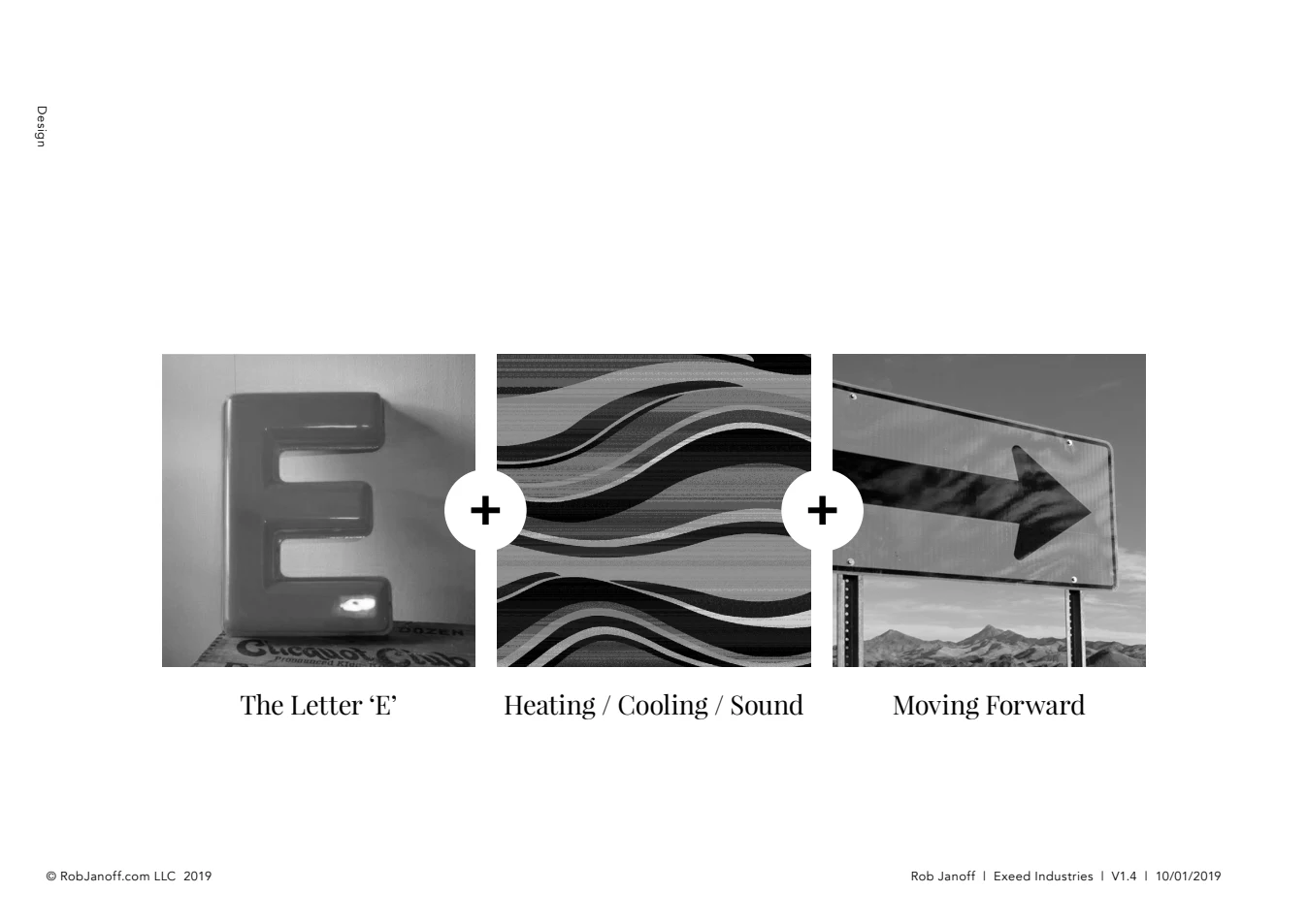
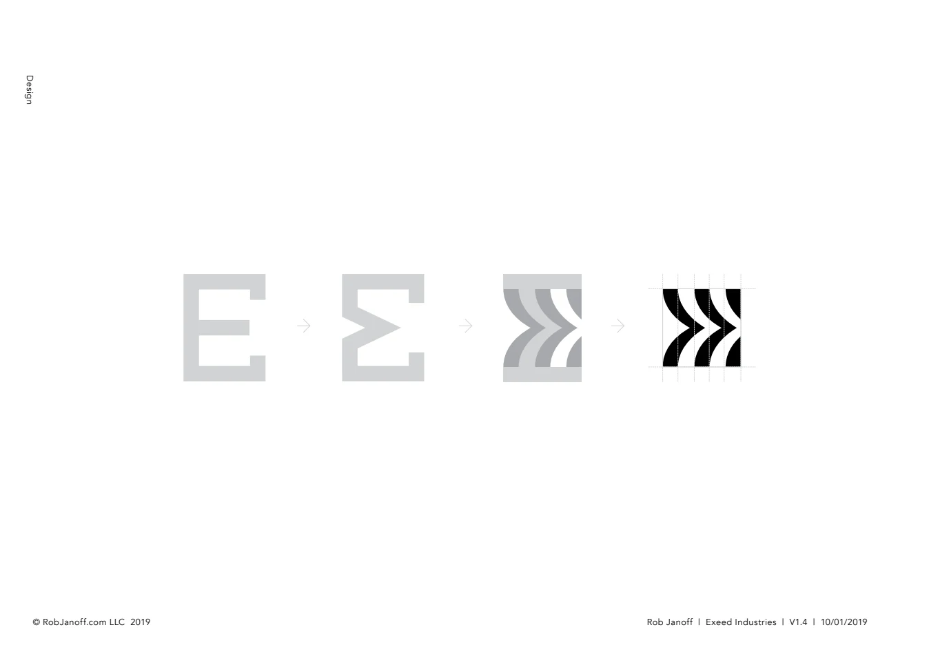
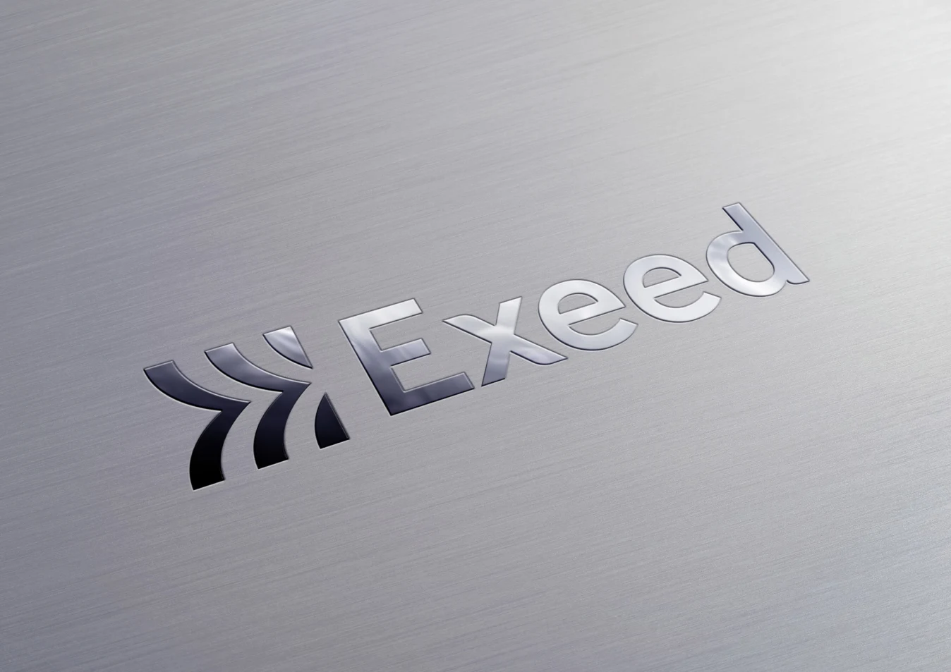
The concept brought three references together: the letter E, the flow of heating, cooling and sound, and forward movement. The result gives Exeed a recognisable initial with a sense of energy. Its repeated forms also create a graphic language that can extend across a vehicle, a display or a large surface.
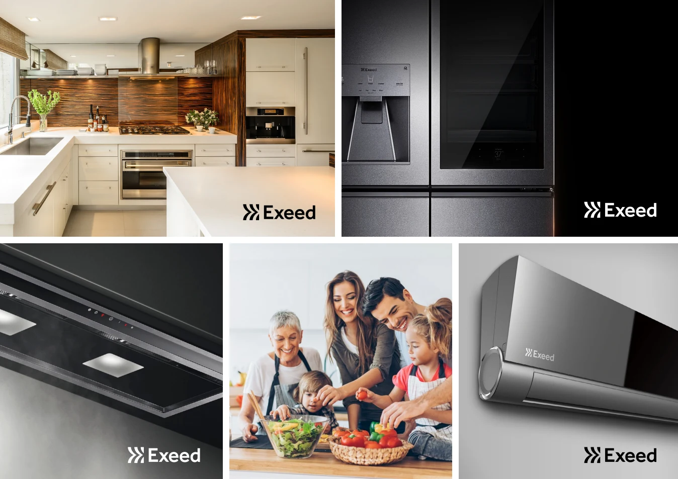
The presentation explored how that idea could feel assured in industry and approachable in the home. The ambition was a clear, memorable expression with enough flexibility to serve both. The development drawings below are the original project material, showing how the idea was worked through.
THE BRAND FAMILY
Related, without being identical
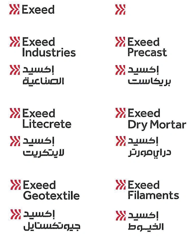
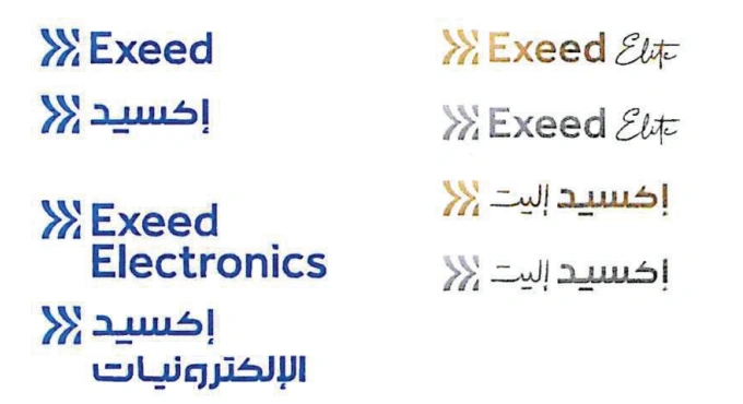
The group needed a family of identities that could accommodate different businesses without losing the connection between them. The approved set includes Industries, Precast, Litecrete, Dry Mortar, Geotextile and Filaments, alongside the consumer and Electronics identities and the Elite variants.
Colour helps organise that family. Red carries the corporate and industrial expressions; blue distinguishes the consumer and Electronics applications; gold and silver appear in the Elite variants. The symbol provides continuity while the names and colour treatments give each expression a defined role.
ENGLISH & ARABIC
One family, two scripts
The final approved artwork pairs English and Arabic versions across the company names and consumer variants. Each is a complete composition: symbol, lettering, spacing and proportion work together. Consistency comes from that shared visual discipline, while allowing each script its own form.
The artwork below is reproduced directly from the approved logo sheet. It shows the bilingual family as delivered in 2019, including the industrial divisions, Electronics and Elite. Each approved variant retains the balance and character of its original composition.
FROM PRESENTATION TO HANDOVER
A considered set of decisions
The project moved from concept and application studies to an approved family of logo assets. The presentation set out the spacing, colour and naming relationships; the subsequent sign-off recorded the final English and Arabic variants. Together, they show the work involved in making one idea useful across a diverse organisation.
Application images on this page are original design-presentation studies and renders. They illustrate the proposed identity system, rather than documenting a completed physical rollout.