
ROB JANOFF / THE APPLE IDENTITY
A simple idea
takes a bite
Before the icon, there was a young company, a new computer and a real piece of fruit.
1977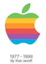
01 / A NEW BEGINNING
A computer company
finding its face
In early 1977, Rob met Steve Jobs as Apple prepared to introduce the Apple II. The company was still small; the identity needed to accompany its next step into the world.
Rob’s exploration began with real apples and their cross-sections. From that observation came the rainbow-striped symbol presented to Jobs.
THE DETAILS / TWO SIMPLE DECISIONS
Why the bite?
Why the colour?
A question of scale
The bite helps us read the shape as an apple rather than a smaller fruit, such as a cherry. It gives the symbol an immediate point of recognition.
A more human technology
The rainbow stripes connected the identity with the Apple II’s colour capabilities. They also gave it a sense of life and playfulness—an inviting expression for a new kind of computer.
02 / AN IDEA IN THE WORLD
From a drawing
to everyday life
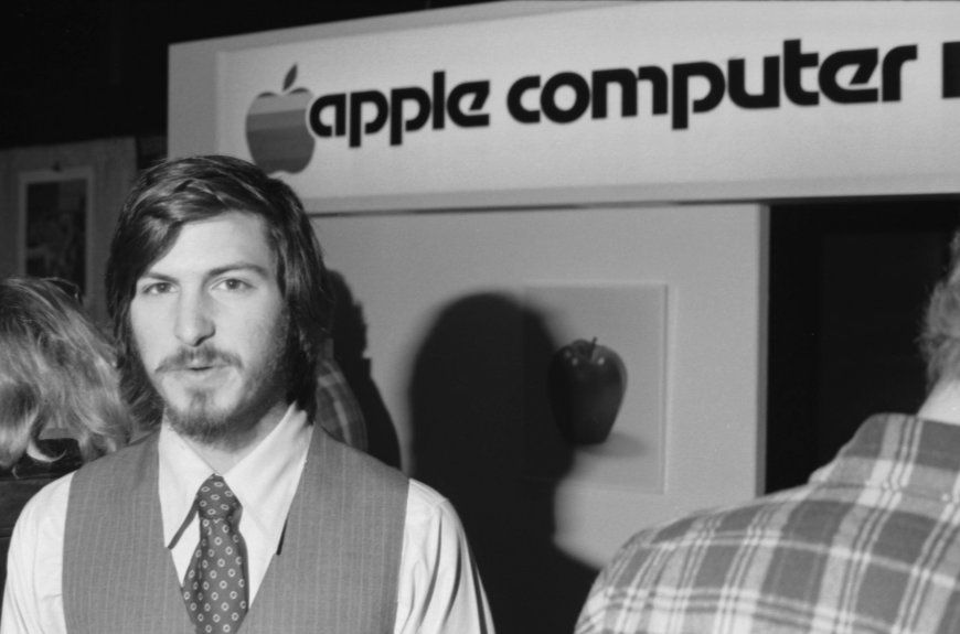
Once approved, the identity was prepared for advertising, signs, hardware and cassette labels ahead of the Apple II’s April 1977 appearance at the West Coast Computer Fair.
The rainbow version remained in use for roughly two decades. Its story is a reminder that a simple form can carry a great deal of character.
THE THINKING CONTINUES
Start with something
people understand
The tools change. The need for a clear, human idea stays.
Explore more of our work ↗