
A feeling for lifeAt your fingertips
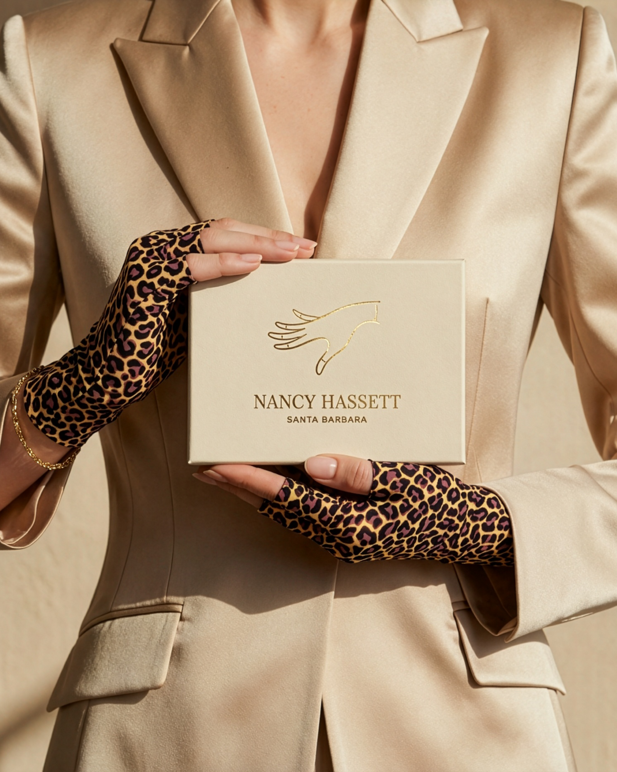
Nancy Hassett designs and makes lightweight fingerless gloves. Our work helped give this Santa Barbara label a distinctive identity, connecting the practical freedom of the product with the confidence and pleasure of wearing it.
SANTA BARBARA / FASHION ACCESSORIESTHE CLIENT / NANCY HASSETT GLOVES
A small accessory
with a personal purpose
The idea starts with something wonderfully ordinary: wanting to feel comfortable in your own hands. Nancy Hassett’s fingerless gloves leave the fingertips free, so wearing them needn’t interrupt a conversation, a coffee or the use of a phone. Jewellery and a manicure remain part of the look.
Designed in Santa Barbara, the range brings together light, close-fitting fabrics, expressive colour and pattern. The ambition is an accessory that earns its place in everyday life, as easily as it dresses up an evening.
THE WOMAN BEHIND THE NAME
A founder who couldn’t find
what she wanted to wear
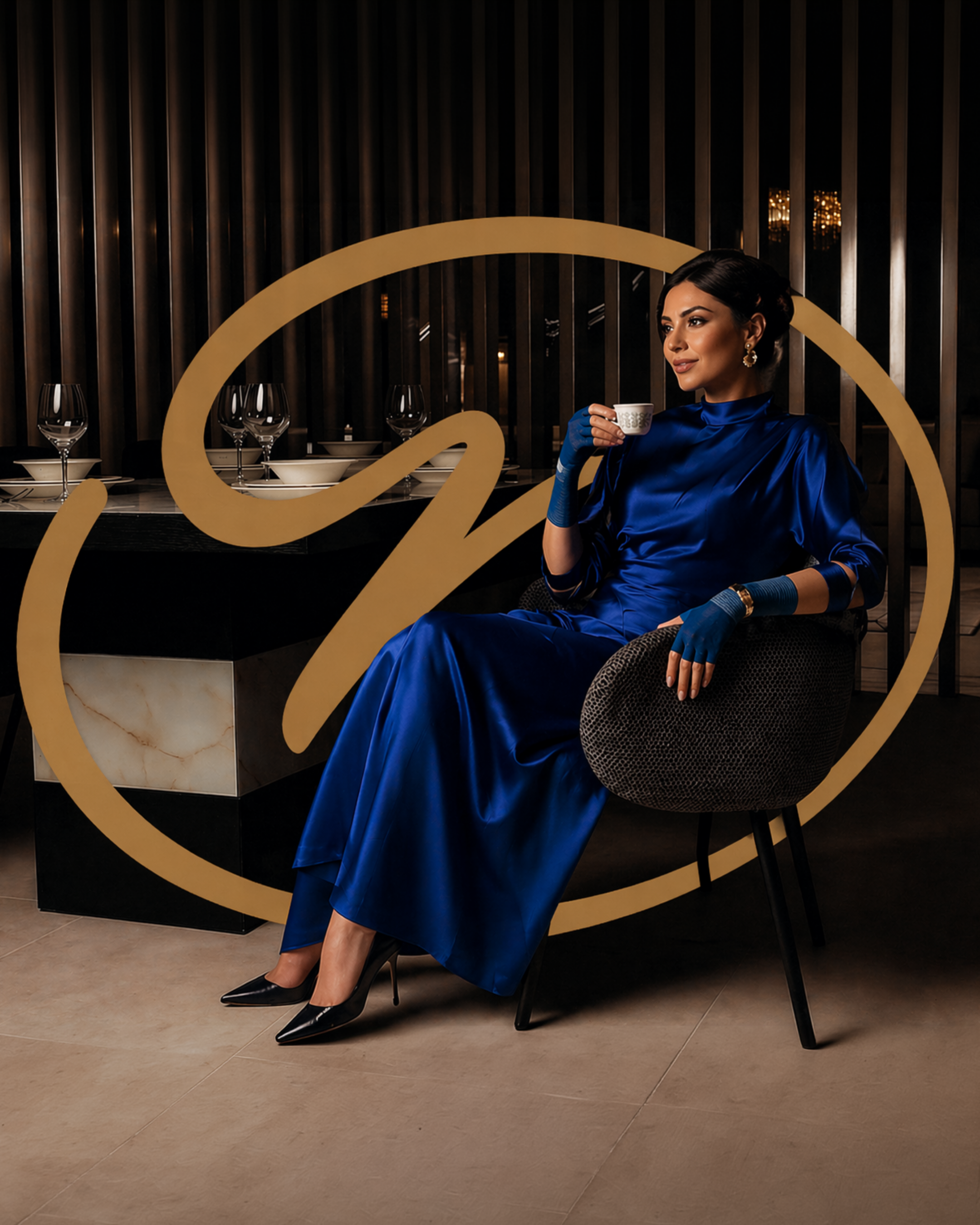
Nancy wanted a glove that felt almost weightless, worked with her favourite jewellery and could stay on from daytime errands to an evening out. Sun protection was part of that ambition, but so was style. When she couldn’t find the combination, she set about creating it.
It was a new chapter in an entrepreneurial life that had already taken her through travel, hospitality, a Colorado vineyard and property design. Nancy says she spent more than three years assembling the designers, textile specialists and technicians needed to develop the gloves. That persistence gives the brand its personal centre: a product she wanted for herself, thoughtfully developed for other women.
THE STRATEGIC STARTING POINT
Freedom to move
Room to express yourself
Our discovery work began under the working name Hanzi. It examined a category pulled between traditional occasionwear and purely practical gloves. The opportunity was more specific: an expressive fashion accessory that offered comfort and coverage while leaving touch, movement and personal style intact.
We considered women drawn to understated elegance, those looking for adaptable day-to-evening pieces, and those who use colour and print more boldly. Their tastes differed; the desire to feel comfortable and confident connected them. That gave the identity a useful task: make the product feel desirable on its own terms, with enough range to welcome different personalities.
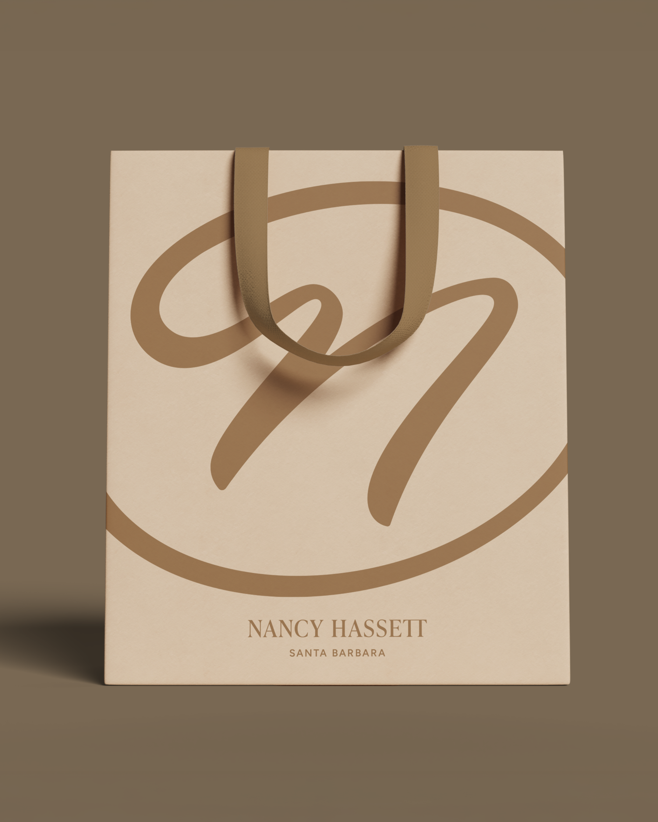
The founder’s name puts a real person at the centre of the brand. In the supplied applications, the expressive monogram, fine-line hand motif and Santa Barbara signature give the collection a recognisable visual vocabulary, from a small presentation box to a generously scaled shopping bag.
THE IDENTITY IN MOTION
A brand made to be worn
The campaign moves beyond packaging to show the gloves as part of an outfit: the gesture, the pattern and the way a hand remains free. These original films bring that side of the brand into the story.
PACKAGING & PRESENTATION
The experience
around the gloves
Packaging gives the identity another scale. A large, flowing monogram turns the bag into a recognisable part of the brand; the name and Santa Barbara signature provide a quieter counterpoint.
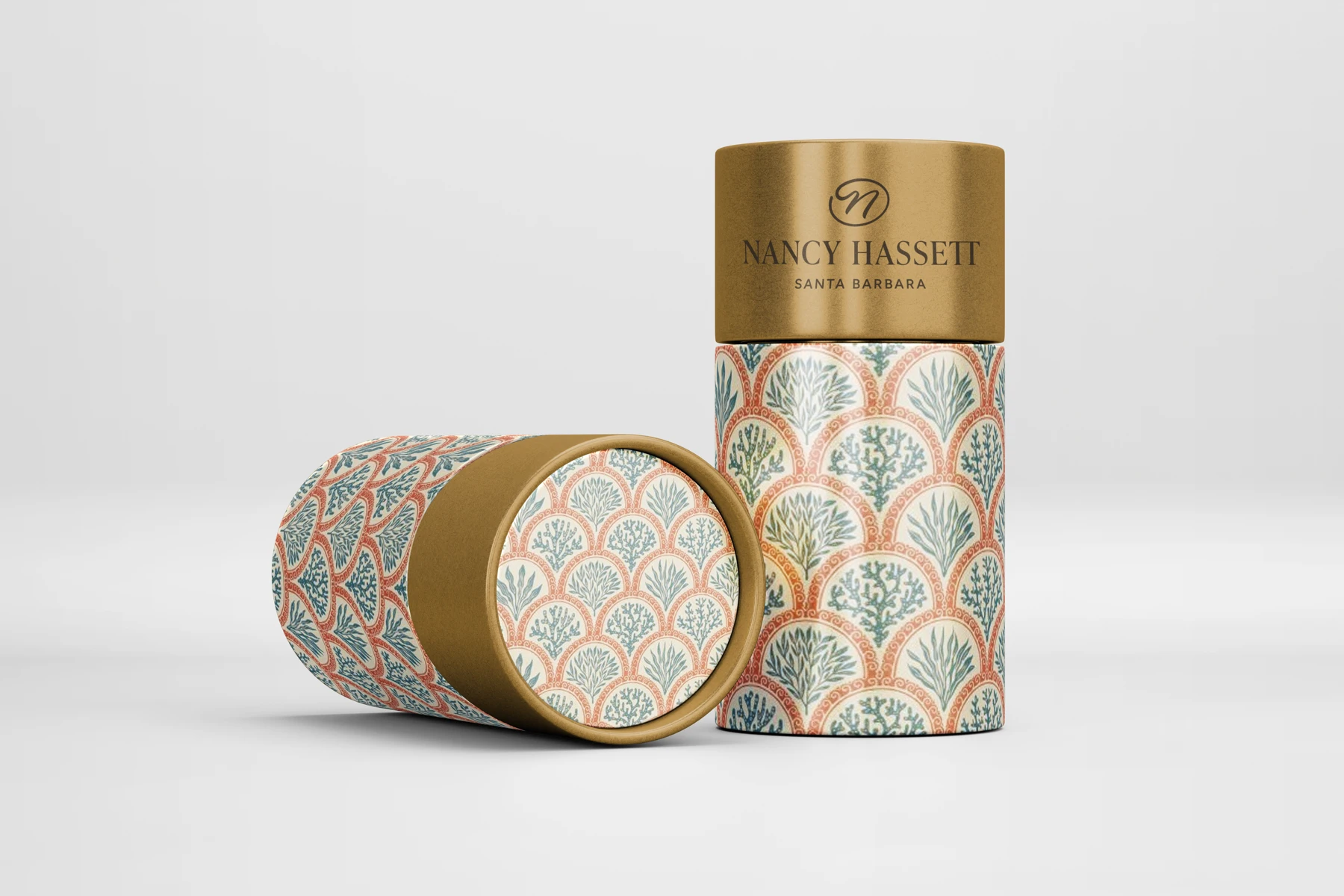
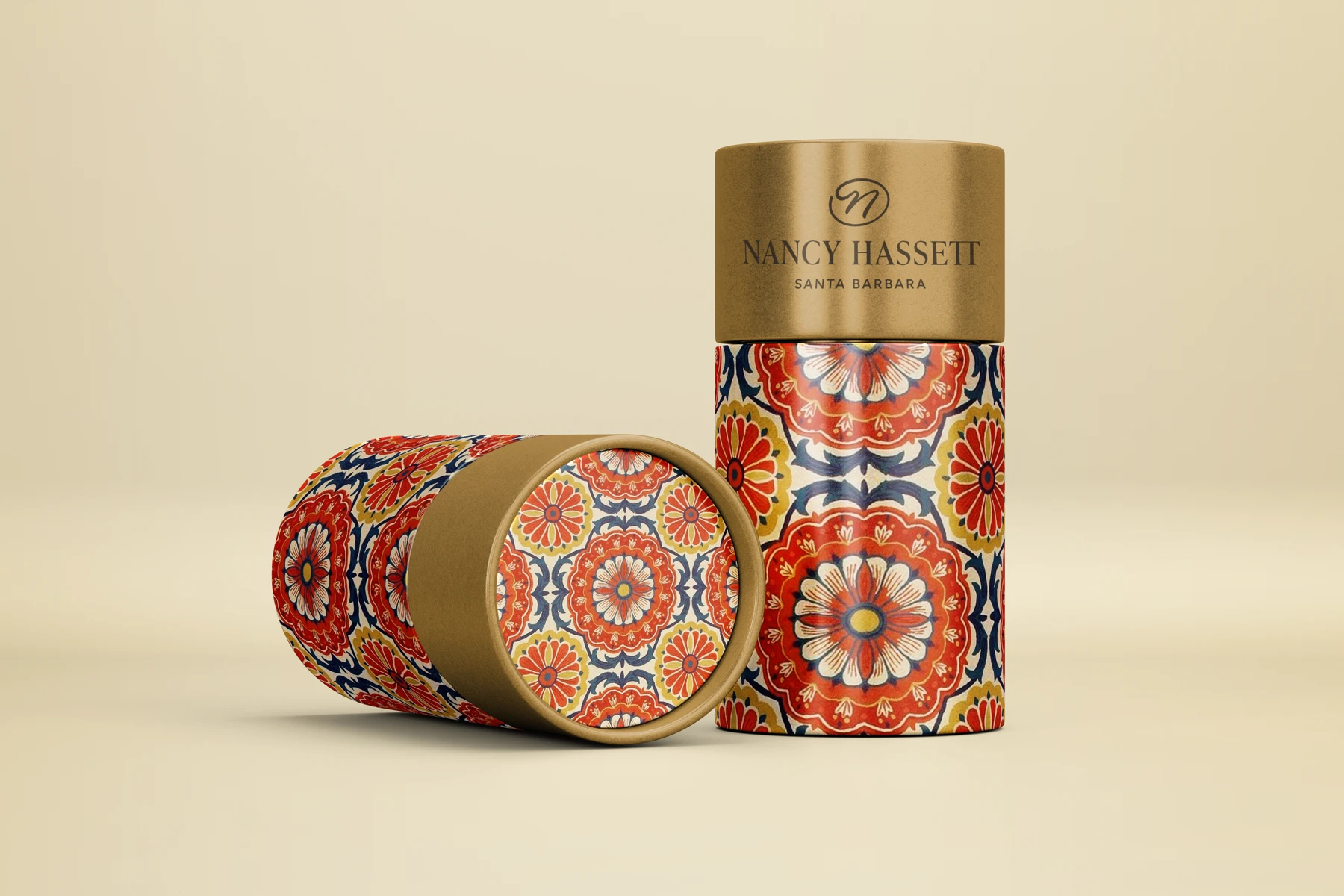
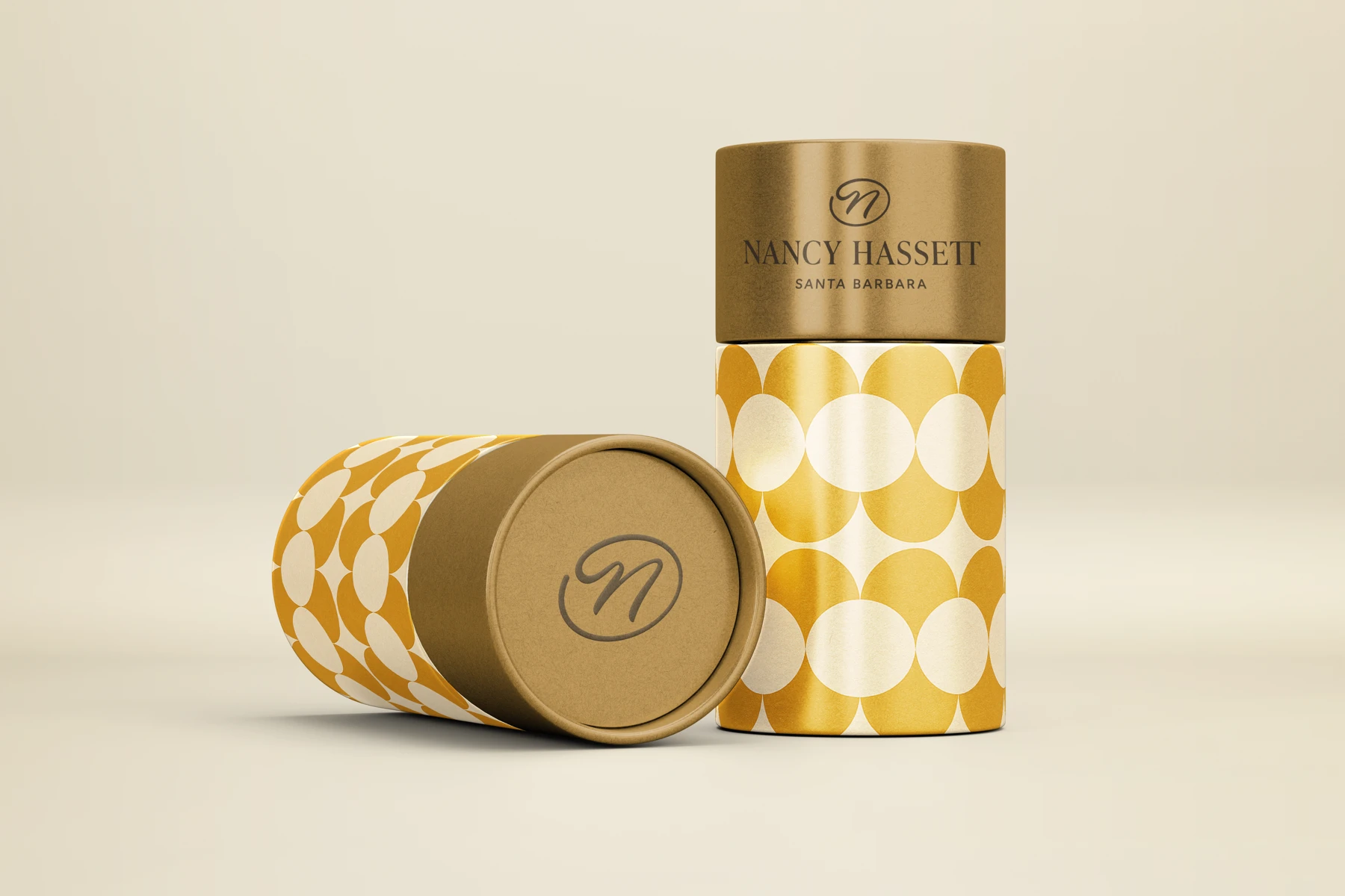
The cylinder studies below explore a different route through colour and pattern. They belong to the design process and are shown as explorations, alongside the supplied campaign and presentation imagery.
THE IDEA
Character you can
hold in your hands
The exploration draws on the warmth and decorative rhythm of Santa Barbara: repeating arches, tile-like geometry and a sunlit palette.
Those references become a visual language that can move across a family of products. The packaging studies test how much pattern, colour and restraint each expression needs.
02 / EXPLORING THE RANGE
Turn up
the colour
Different expressions, seen together. The original renders show how the same cylindrical format can carry a richer decorative language or a quieter geometric one.
03 / FROM EXPLORATION TO A SYSTEM
Room for variety
A sense of family
The useful test is not whether every pack looks identical. It is whether the shapes, colours and patterns feel related when they sit side by side. These studies make that conversation tangible before production decisions are made.
Shown here: design explorations and packaging renders, rather than a record of manufactured products.
NEXT PROJECT